

What You Need to Know: 8 Simple Rules for Great Email Design
by Audrey Howes
Email marketing has been and will continue to be one of the most central components to most companies marketing strategies. The potential ROI is just too good to ignore. The difference between successful email marketing and trips to the junk bin hinge on one main component: email design. Here are eight tips to take your email designs from good to great.
-
 Your Brand Has a Style
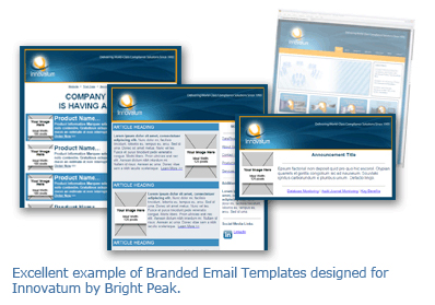
Over 20% of the Swiftpage emarketing customers we surveyed last month about Email Marketing and Design said their emails don’t match their company branding. We know it is tempting to do your own thing, but the cost might not be worth it. Customers build familiarity and trust with your brand by repeatedly seeing your company’s logo, colors, font styles, etc. Especially in email, customers want to know exactly who is sending the email and only trust emails that look familiar. We recommend that you create a simple style guide for your company. Make a list of acceptable fonts, colors, secondary colors, and logos that can be used for various publications. If you already have a style guide in place, do an email check-up to see what is aligned with the guide and what needs some adjustment. -
Match Emails to Print Pieces
In a perfect world you could design an email newsletter, print it, and mail it to customers who don’t get email. Well here’s the reality, email and print design are two entirely different animals. Here are just a few of the differences:- Emails are designed at 72 DPI (low resolution) and print pieces are designed at a minimum of 150 DPI (higher resolution), so printing emails will never be as pretty since the resolutions differ.
Email widths are generally narrower at 600 pixels wide to make image downloading faster, viewing more accessible, and keeping email sizes small for increased deliverability.
Print pieces are usually 8.5 inches wide (1275 pixels at 150 DPI) allowing for higher quality printing functionality and file size is not a obstacle
- Emails are designed at 72 DPI (low resolution) and print pieces are designed at a minimum of 150 DPI (higher resolution), so printing emails will never be as pretty since the resolutions differ.
- There is no limit to which font can be used on print pieces while emails are limited to web-safe fonts. Make sure you have uniform fonts for both marketing pieces. Read our recent blog post with some creative font ideas here. >
- Print pieces can expand over many pages whereas emails need to be short and sweet to capture the reader’s attention.
- Printing is significantly more costly than sending emails and is almost impossible to track results.
A well-designed print piece can certainly be used to inspire an email design for brand consistency. If you need some assistance making your brand consistent, just reach out to Bright Peak to take the inspiration and make it reality.
-
The Top Spot
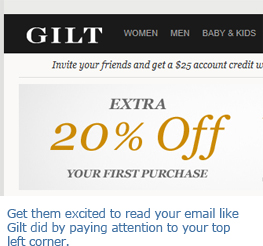 We’ve said it before and we’ll say it again, pay attention to the space at the top left of your email. The top section is what pops up in preview panes and on mobile devices. Plus it is where the eye naturally starts to begin scanning. Make sure to include your company name and/or logo in the top section along with some of your key email text to draw your readers in. top section should make readers want to keep scrolling through your email, so be creative! Use current branding, optimized navigation links, and custom taglines to make your email’s purpose known.
-
Drive ‘Em to the Right
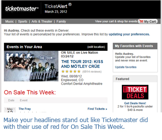
In a recent study using eyetracking heatmaps, MarketingSherpa’s team found an interesting trend in click patterns. They discovered that readers click more on links found on the right side of emails and links closer to the top. Add your most important call to action to the top right sections of your email to take advantage of our clicking tendencies. In addition, try to move other hyperlinks to the edges of paragraphs rather than burying them within the text and include a line break before ‘Read More’ or ‘Learn More’ links. Think of reading your email in an “F” shape−left to right with your eye ending on the right side.
-
An Image Here, An Image There
In our Email Marketing and Design Survey, 78% of you told us that you prefer to receive emails with either mostly images or a balance of text and images and we agree. Images are a key component in email design, but they can’t be the only thing. Small to medium sized businesses should to include a healthy mix of images and text to get the most impact from emails. Balance is the key to a well-received email. Small businesses aren’t on the same level as big box retailers who send image-only emails because they have incredible brand recognition. Ask yourself, if your images did not display correctly or at all – is your email’s message still conveyed?
Common email image items are: header images, logos, buttons, charts and graphs, footers, social media icons, and content-oriented images.
Common text items are: taglines, headlines, main body text, hyperlinks, pricing, and tables
-
The Great Image Hunt
 When searching for images to add to your emails, please don’t just ‘Google it.’ Google and other search engines image searches don’t give you permission to use what you find. Most of the images are copyrighted and you need permission to use them in business communications. Instead look at sites like istock.com offering low cost images or morguefile.com for free images. Iconfinder.com is another helpful site and offers the ability to search for icons based on license filters. Those are just a few examples. There are many more sites out there that can help you find professional images to add a little something to your email.
-
Headlines Should Pop
Newsflash: Emails aren’t really read, they are scanned. Our inboxes are too full for us to give every email we receive the attention we give the latest New York Times best seller. To aid in the scanning process, make your headlines stand out from the rest of the text. Try using a larger font size, bolding or italicizing the font, changing the font color, or a combination. When you apply the headline style, sit back from your screen and take a practice scan. If the headlines don’t grab you, try a different combination to engage readers. Don’t be obnoxious with overly-large text or oddly colored headlines that make it hard to read and look like junk mail. -
We Don’t Like It Either
 No one, including us, likes the email testing process. Testing emails is boring, tedious, frustrating, and necessary. It is amazing what small errors or glitches you will find during the testing process. Better for you to find them and fix them than to hear negative feedback from your readers. Set up accounts on the bigger free email clients such as Gmail, Yahoo, and Hotmail. Send tests to all of your free accounts and look over the email in multiple browsers, Firefox, Internet Explorer, and Chrome. If you have a mobile device that receives email, check out your test email on the device. Also send the email to desktop email clients such as Outlook and Apple Mail. If you really prefer to leave the testing to the experts, check out Bright Peak’s email analysis service that previews email campaigns in over 30 email clients and 8 mobile devices.
As one respondent from our recent survey put it, "Email design is critical to our success." While good email design can feel challenging at first, once you have put these tips into practice, it will soon become habit. Don’t let the initial challenge of email design stop you from the success on the horizon!